The 2020 Olympics is turning out to be one controversy after another. Granted, compared to the expensive debacle of the National Stadium — to which the original architecture firm has also now hit back against the Japan Sport Council’s attempts to scapegoat it — this is a minor one.
When Kenjiro Sano’s Tokyo 2020 Olympic and Paralympic Games logo was unveiled on July 24th, exactly five years before the Games are set to open, the conversation at least shifted from construction costs and pointing the finger of blame to typography and colors.
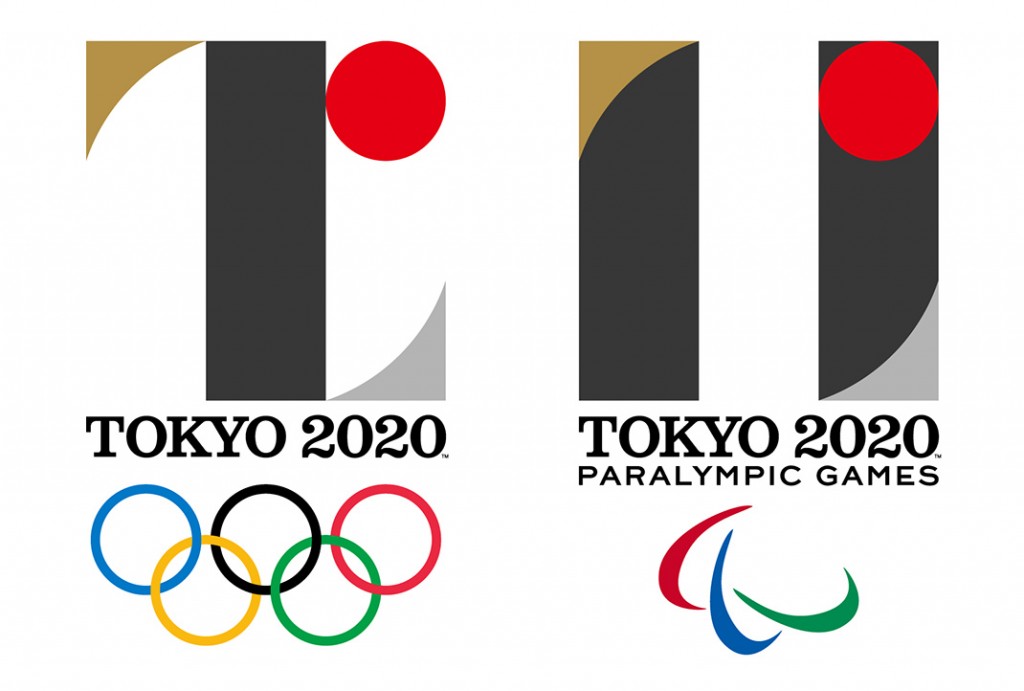
The logo, though, has divided people. Some praised its cool retro feel, while others felt it was hard to understand or too backward-looking.
At any rate, it got a thumbs-up from Spoon Tamago, the leading overseas blog about Japanese design.
The emblems are characterized by modern, abstract representations of the letter T. The symbolic letter stands for Team – “When the world comes together for Tokyo 2020, we will experience the joy of uniting as one team.” It also stands for Tomorrow – “for a better world and a brighter future.” And of course it also is the first letter of the host city: Tokyo.
We love the shapes and colors and our overall first impressions is pretty great. It’s incredibly difficult to design for the future but this artwork seems pretty timeless.
However, now accusations have surfaced that Sano’s logo, knowingly or otherwise, is a copy of the logo for Théâtre de Liège, a theater in Belgium.
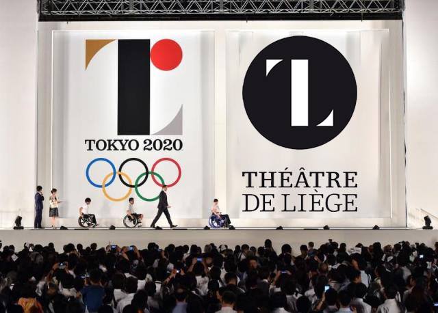
It’s not just the obvious parallels with the “T”. Even the fonts appear similar.
Of course, some of those crying plagiarism are merely social media users with perhaps too much time on their hands, but designers have also joined in.
Théâtre de Liège vs Tokyo 2020
#Tokyo2020 #ThéâtredeLiège #plagiat? pic.twitter.com/u64MpWBAI2
— Olivier Debie (@OliDebie) July 28, 2015
For our money, we seriously doubt Sano would submit a design that willingly resembled another one and it is very conceivable that his knowledge of theater venues in Europe is not comprehensive enough to have seen the Théâtre de Liège logo before. Still, it might be good if he makes a statement to calm the storm down.
Tellingly, Sano chose to delete his social media presence before the logo was released. Perhaps he — or his minders — were fearful of a backlash.


1 Comment
This is really sad, not only is it really obvious that it is stolen, but a great designer as Kenjiro Sano has the talent to make great logo’s without having to jump to these kind of methods. A slap in the face to all designers in the world, especially Olivier Debie.