The new 2020 Tokyo Olympic and Paralympic Games logo has been announced.
The official logo was confirmed today as “Harmonized Chequered Emblems,” which was Design A in the shortlist and arguably the most Japanese in style. The logos are the work of designer Asao Tokoro (also spelt Tokolo).
![]()
Chequered patterns have been popular in many countries around the world throughout history. In Japan, the chequered pattern became formally known as “ichimatsu moyo” in the Edo period (1603-1867), and this chequered design in the traditional Japanese colour of indigo blue expresses a refined elegance and sophistication that exemplifies Japan.
Composed of three varieties of rectangular shapes, the design represents different countries, cultures and ways of thinking. It incorporates the message of “unity in diversity”. It also expresses that the Olympic and Paralympic Games seek to promote diversity as a platform to connect the world.
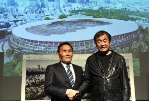
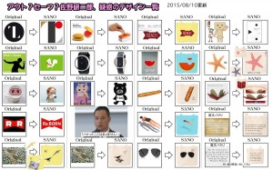
As people who have been following Tokyo’s disastrous preparations for the 2020 Games will know, the original logo (or “emblem” in the organizers’ parlance) was withdrawn after multiple allegations of plagiarism were leveled at Kenjiro Sano, the designer, including that his firm may have stolen the Olympic logo idea from a Belgian theatre’s logo.
A shortlist of four logos, selected from 14,599 entries, was announced in early April and members of the public were able to submit feedback online.
“The comments and opinions received will serve as a valuable frame of reference to the Tokyo 2020 Emblems Selection Committee,” the organizers claimed.
In practice, we’re not sure how that worked. Was the feedback actually read and noted? Did it influence the design on the logo?
Just to recap, here are the other three shortlisted logos and their official statements.
B. Connecting Circle, Expanding Harmony
![]()
This design expresses the connection between the dynamism of the athletes and the joy of the spectators, and the expansion of peace and harmony throughout the world.
It seeks to encompass mental and physical strength, dynamic movement and speed, and the euphoric emotions that the world derives from outstanding athletic performances.
The design also expresses the respect and warm hospitality that will be accorded to visitors from around the world to the Tokyo 2020 Games.
C. Surpassing One’s Personal Best
![]()
These emblems were inspired by the traditional Wind God and the Thunder God, and seek to convey dynamic movement at the instant an athlete breaks the tape on the finish line. They also represent athletes as they endeavour to attain and surpass their personal best.
The Wind God and the Thunder God have been much loved by the people of Japan for centuries. (e.g. the famous painting by the early 17th-century Japanese artist Tawaraya Sotatsu, and the statues of these Gods at the Kaminari-mon Gate in Tokyo’s Asakusa district)
In the original depiction, the taiko drums held by the Thunder God are represented by fireworks, while the Wind Cloth held by the Wind God is replaced by the portrayal of a rainbow to symbolise the concepts of peace, diversity and harmony.
The emblems also express the athletes’ continued contribution to peace through their mental and physical tenacity, and a connection to the future.
D. Flowering of Emotions
![]()
The morning glory flower as it faces up towards the heavens to greet the new morning, expresses the faces of athletes striving to attain a personal best and the bright faces of people as they applaud the athletes. The upward-looking morning glory also represents the climax of this range of emotions.
The seed of the morning glory sprouts, the vine grows, and the flower opens. The process of the flower growing and eventually returning to seed conveys the sense of expectation for the Games and succession to the next generation.
This flower was particularly popular during Japan’s Edo period (1603-1867), and remains a firm favourite (e.g. as subject for “Ukiyoe” prints.) It signifies a heightened sense of anticipation towards the 2020 Games and the warm welcome that visitors from around the world will receive.
For reference, here is the withdrawn original logo by Kenjiro Sano.
![]()
Some on social media have even cheekily suggested this parody logo (source unknown) as a more suitable visual ambassador for the upcoming Games.
![]()